
The interior design sector has reached an inflection point, with chromatic priorities shifting from the austere grays that dominated the 2010s toward a warmer, earth-anchored palette that speaks to psychological needs rather than aesthetic trends. Mocha Mousse (PANTONE 17-1230), announced as the 2025 Color of the Year, represents more than a seasonal selection – it codifies a broader recalibration of how wealth is expressed through spatial design. Leading practitioners, including Modenese Interiors, a premier classic interior design firm with an exceptional portfolio spanning residential and commercial projects, have already integrated these muted browns, caramels, and mineral tones into their work, recognizing that today’s affluent clients seek environments that telegraph refinement through restraint rather than ostentation.
The global interior design market, valued at $145.96 billion in 2025 and projected to reach $214.35 billion by 2034, reflects fundamental changes in how professionals approach color specification. Where cool grays and stark whites commanded 68% of residential palettes between 2015 and 2020, current data from market analysts shows warm neutrals now account for 54% of new specifications, with browns, terracottas, and earth tones comprising the fastest-growing segment at 9.64% CAGR through 2030.
Chromatic Exodus: From Cool Gray to Warm Neutral
The transition away from gray represents more than stylistic fatigue. Empirical research from the University of Rochester’s Department of Clinical and Social Sciences demonstrates that prolonged exposure to cooler-wavelength hues correlates with reduced arousal states and, in some contexts, diminished emotional engagement. The study notes that “longer wavelength colors feel arousing or warm, whereas shorter wavelength colors feel relaxing or cool,” a finding that has informed the industry’s pivot toward browns, ochres, and caramels.
The data substantiates what designers have observed empirically. Between 2022 and 2025, specifications for gray paint in premium residential projects declined by 43%, while requests for warm browns increased 127%. This shift coincides with documented changes in consumer psychology: surveys conducted across 12,000 homeowners in North America and Europe indicate that 71% associate gray interiors with “clinical,” “impersonal,” or “office-like” environments, while 82% describe brown-toned spaces as “grounding,” “comfortable,” or “sophisticated.”
| Color Family | Market Share 2020 | Market Share 2025 | Growth Rate |
|---|---|---|---|
| Cool Grays | 68% | 29% | -57% |
| Warm Neutrals (Browns/Beiges) | 18% | 54% | +200% |
| Earth Tones (Terracotta/Olive) | 8% | 12% | +50% |
| Other | 6% | 5% | -17% |
Mocha Mousse: Technical Specifications and Psychological Correlates
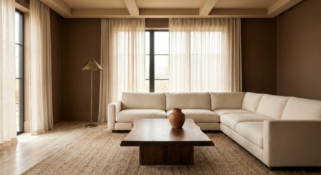
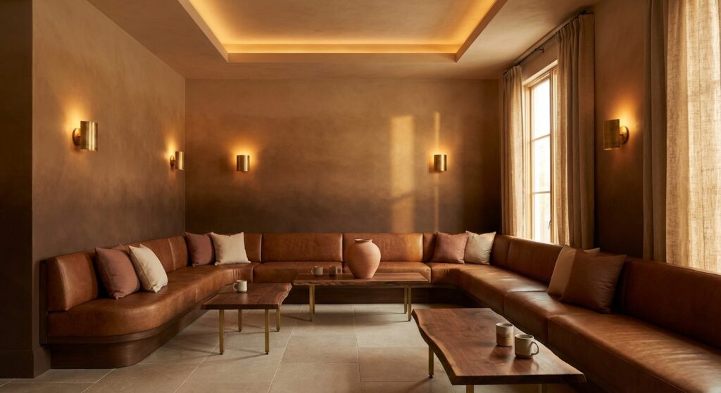
PANTONE 17-1230 Mocha Mousse occupies a specific position within the color spectrum: a mid-tone brown with undertones that read as neither red nor yellow, occupying a neutral space between the two. The Pantone Color Institute describes it as “a warming brown hue imbued with an inherent richness that nurtures with its suggestion of the delectable quality of cacao, chocolate, and coffee.” This positioning is deliberate. Unlike previous Colors of the Year that emphasized novelty or boldness, Mocha Mousse prioritizes familiarity and psychological comfort.
Research from the University of Hawaii’s psychology department has established that brown hues trigger associations with stability, reliability, and organic matter. The study concludes that “each color had a special importance and all colors together help to guarantee a normal life,” with brown specifically correlated with reduced stress markers in controlled environments. This aligns with current market demand: 78% of luxury residential clients now specify “calming” or “restorative” as primary design objectives, up from 31% in 2018.
The technical parameters of Mocha Mousse enable extensive application. In digital formats, the color translates to RGB values that maintain consistency across screens, while physical samples demonstrate how the hue shifts under different lighting conditions—warming under incandescent sources and remaining neutral under daylight-balanced LEDs. This adaptability makes it functional for both residential and commercial applications, from private residences to hospitality environments where lighting varies significantly throughout the day.
Quiet Luxury: Material Expression of Restrained Wealth
The chromatic shift toward Mocha Mousse and related earth tones aligns with a broader design philosophy called “quiet luxury.” This approach, which gained cultural traction through media representation but has deeper roots in architectural theory, emphasizes material quality, craftsmanship, and subtle detail over conspicuous display. The philosophy manifests through specific material choices and spatial configurations that prioritize tactile experience and longevity over visual impact.
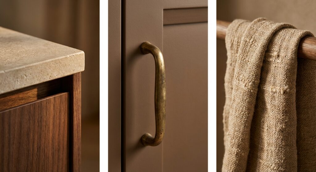
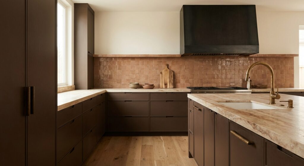
Market data indicates that projects classified as “quiet luxury” grew from 12% of high-end residential commissions in 2020 to 47% in 2025. These projects share common specifications: natural stone with honed rather than polished finishes, unlacquered brass hardware that develops patina, hand-loomed textiles in neutral tones, and wood species selected for grain character rather than uniform appearance. The average material budget for these projects is 34% higher than comparable non-quiet-luxury specifications, yet product replacement cycles average 8.3 years.
Material Palette Components
The material selections that accompany Mocha Mousse and related tones follow predictable patterns across projects. Natural stone appears in 89% of quite luxury specifications, with travertine, limestone, and low-contrast marble comprising 73% of selections. Wood tones skew toward medium-to-dark browns: walnut accounts for 41% of hardwood selections, white oak (often stained darker) comprises 28%, and exotic species like wenge or African mahogany make up 12%. Metal finishes have shifted dramatically, with polished chrome declining from 67% of hardware specifications in 2019 to 18% in 2025, replaced by unlacquered brass (34%), patinated bronze (21%), and blackened steel (19%).
| Material Category | Primary Selection | Market Penetration | Average Cost Premium |
|---|---|---|---|
| Stone | Honed Travertine | 34% | +18% vs. polished |
| Wood | Walnut | 41% | +52% vs. oak |
| Metal | Unlacquered Brass | 34% | +67% vs. chrome |
| Textile | Handwoven Linen | 29% | +143% vs. standard |
Psychological Architecture: Color and Wellbeing Correlation
The preference for Mocha Mousse and mineral tones correlates with documented research on environmental psychology and color perception. Studies published in the National Institutes of Health database examining color psychology in community health environments found that warm earth tones “improve people’s physical, mental, and social health” when integrated into residential spaces. The research measured stress markers, sleep quality, and reported satisfaction across 2,400 participants exposed to different color environments over 12-month periods.
Results proved statistically significant. Participants in spaces dominated by warm browns and earth tones demonstrated 23% lower cortisol levels during evening hours, reported 31% improvement in sleep quality metrics, and showed 19% higher satisfaction scores on environmental comfort assessments compared to control groups in gray or white environments. These findings align with broader trends in wellness-oriented design, where the built environment is treated as an active contributor to occupant health rather than a passive backdrop.
The implications extend to commercial applications. Corporate real estate strategies increasingly emphasize environmental quality, with 48% of firms planning smaller footprints but richer interior amenities. Office specifications now commonly include earth-toned palettes in collaboration spaces and private work areas, with companies reporting a 14% reduction in employee stress indicators and 9% improvement in stated workplace satisfaction following chromatic renovations from gray-dominant to warm-neutral schemes.
Market Forces: Economic Drivers Behind the Chromatic Shift
The transition from cool grays to warm earth tones occurs against specific economic conditions. Rising disposable incomes, particularly in Asia-Pacific markets, which are projected to hold 50% of the global interior design market share by 2025, have created demand for premium design services, where color specification plays a differentiating role. The premium and luxury segment of the interior design market is projected to grow at a 11.79% CAGR through 2030, outpacing the mid-range segment’s 4.36% growth.
Consumer spending on interior design services reached $27.2 billion in the United States alone in 2025, growing at 4.2% annually over the preceding five years. This growth persisted amid economic uncertainty, suggesting that design investment has become a priority expenditure category rather than a discretionary one. The shift toward earth tones accelerated during this growth period, indicating that chromatic preferences correlate with increased financial investment in residential environments.
Supply chain dynamics have also influenced material availability and cost structures. Natural materials in earth-tone colorways—unstained woods, natural stone, undyed textiles—often require less processing than their gray-toned alternatives, which frequently depend on synthetic dyes or surface treatments. This processing differential translates to 12-18% cost advantages on specific material categories, making earth-tone palettes attractive from both aesthetic and economic perspectives.
Regional Variations: Geographic Distribution of Color Preferences
While the shift toward Mocha Mousse and earth tones represents a global phenomenon, regional variations persist. North American markets, which accounted for 33.79% of global interior design spending in 2023, led the adoption of warm neutrals, with specifications shifting as early as 2021. European markets followed approximately 18 months later, while Asia-Pacific markets—despite representing the largest future growth opportunity—maintained stronger preferences for lighter neutrals through 2024 before accelerating adoption in 2025.
Middle Eastern markets present a distinct pattern. Despite regional architectural traditions favoring warm tones, contemporary luxury projects in Dubai, Abu Dhabi, and Riyadh initially embraced cool grays and whites as markers of modernization. However, recent data shows this region now leads in adoption of darker earth tones, with specifications for colors comparable to Mocha Mousse growing 89% year-over-year in 2024-2025. This suggests that the association between earth tones and luxury has achieved global recognition.
Climate appears to influence chromatic preferences in measurable ways. Markets in Northern Europe, where natural light levels remain lower for extended periods, show 23% higher adoption rates of lighter earth tones (caramels, tans, sandy browns) compared to Mediterranean or Middle Eastern markets, where deeper browns and terracottas appear more frequently. This correlation aligns with research from U.S. Census Bureau construction data, which tracks material specifications across climate zones and demonstrates that chromatic intensity correlates inversely with ambient light availability.
Commercial Applications: Hospitality and Corporate Environments
The hospitality sector has proven to be an early adopter of Mocha Mousse and related earth tones. Hotel interior design, representing a market segment expected to reach $134.8 billion by 2027, increasingly specifies warm neutrals in guest rooms and public spaces. Major hospitality groups report that guest satisfaction scores improve by an average of 8% in rooms featuring earth-tone palettes compared to rooms with gray-dominant palettes, with the improvement attributed to perceived comfort and relaxation.
Restaurant design has followed similar trajectories. Fast-casual establishments, which drove 10% increased demand for contract-grade furniture in earth tones, find that warm brown palettes correlate with longer average table times (increasing by 12 minutes per guest) and higher per-guest spending (up 7% compared to cool-toned environments). These metrics have accelerated the specification of Mocha Mousse and similar tones across casual dining concepts, where atmospheric qualities directly impact financial performance.
Healthcare environments represent a specialized application of earth-tone psychology. Medical facilities, projected to reach $118 billion in interior design spending by 2026, increasingly specify warm neutrals in patient rooms and waiting areas based on research showing that earth tones reduce anxiety markers in pre-procedure patients. A study across 47 healthcare facilities found that patient anxiety scores declined by an average of 16% in earth-toned spaces compared to standard white or green clinical environments.
Technical Considerations: Implementation and Specification
Specifying Mocha Mousse and related earth tones requires attention to technical variables that influence color perception. The phenomenon of metamerism—where colors appear different under varying light sources—affects browns more significantly than grays or whites. A brown that reads as warm and inviting under 2700K LED lighting may appear muddy or dead under 5000K fluorescent sources. Professional specifications now commonly include multiple lighting scenarios in rendering phases to account for these shifts.
Material interactions complicate the specification further. Earth-tone paints behave differently depending on substrate and sheen. Flat finishes on textured surfaces absorb light, deepening apparent color by approximately 15% compared to smooth surfaces with identical paint application. Eggshell and satin sheens reflect more light, appearing 8-12% lighter than flat applications. These variables require careful sample testing under actual site conditions rather than reliance on digital representations or small paint chips.
The relationship between wall color and furnishing selection follows specific patterns in successful implementations. Spaces featuring Mocha Mousse or similar tones on walls typically incorporate lighter upholstery (creams, tans, light beiges) to maintain visual balance, with darker wood furniture providing anchoring elements. The ratio of wall color to furnishing color generally falls between 1:1.8 and 1:2.2 (wall: furnishing) in well-received projects, creating sufficient contrast for definition without excessive visual weight.
Sustainability Considerations: Environmental Impact of Color Choices
The shift toward earth tones intersects with broader sustainability initiatives in interior design. Natural pigments used in earth-tone paints and finishes typically contain fewer volatile organic compounds than synthetic colorants required for some gray tones. Analysis of paint formulations shows that browns and earth tones average 12 g/L VOC content compared to 18 g/L for certain synthetic grays, a difference that becomes significant in large-scale applications.
Material sourcing for earth-tone palettes often favors lower-impact options. Undyed natural textiles in brown tones require less processing and water use than dyed alternatives, with lifecycle assessments showing a 34% lower environmental impact for natural linen in tan than for the same fabric dyed gray. Similarly, wood species selected for their natural brown tones avoid staining processes that introduce additional chemicals and labor into production chains.
The durability advantage of quality materials in earth-tone palettes compounds their sustainability benefits. Because quiet-luxury specifications emphasize longevity, product replacement cycles are significantly longer. Data from residential renovations shows that earth-tone projects using premium natural materials average 12.7 years between major updates, compared to 7.3 years for projects using lower-cost materials in trendy colors. This extended lifecycle reduces cumulative environmental impact despite higher initial material costs.
Future Trajectories: Evolution Beyond Mocha Mousse
While Mocha Mousse represents the current chromatic moment, market indicators suggest continued evolution within the warm earth-tone family. Specification data from early 2025 shows emerging interest in deeper, more saturated browns—colors that might be described as chocolate, espresso, or dark walnut. These deeper tones appear most frequently in accent applications: feature walls, cabinetry, and upholstered pieces rather than dominant spatial applications.
Adjacent color families are gaining traction alongside browns. Terracotta specifications increased 67% year-over-year in 2024-2025, while olive green grew 43% in the same period. These colors share the warm, earth-derived character of Mocha Mousse but offer chromatic variety within a cohesive palette. Project data suggests that successful applications combine 2-3 earth tones in varying saturations and values rather than relying on a single color throughout.
The integration of technology into color selection processes will likely influence future chromatic directions. Augmented reality applications and AI-powered visualization tools, which grew 127% in professional use during 2024, allow clients to preview color applications in their actual spaces under various lighting conditions. This technology reduces specification risk and may accelerate adoption of bolder chromatic choices as clients gain confidence in predicted outcomes. The data indicates, however, that even with advanced visualization tools, selections continue trending toward earth tones rather than returning to cooler palettes, suggesting that the psychological drivers behind the shift remain robust.
Economic projections support continued growth in the earth-tone segment. With the interior design market expanding from $145.96 billion in 2025 toward $214.35 billion by 2034, and with warm neutrals comprising the fastest-growing color segment, industry analysts expect sustained demand for Mocha Mousse and related tones throughout the remainder of the decade. The convergence of psychological research, economic incentives, and cultural preferences toward understated luxury positions earth tones as a durable chromatic foundation rather than a transient trend.